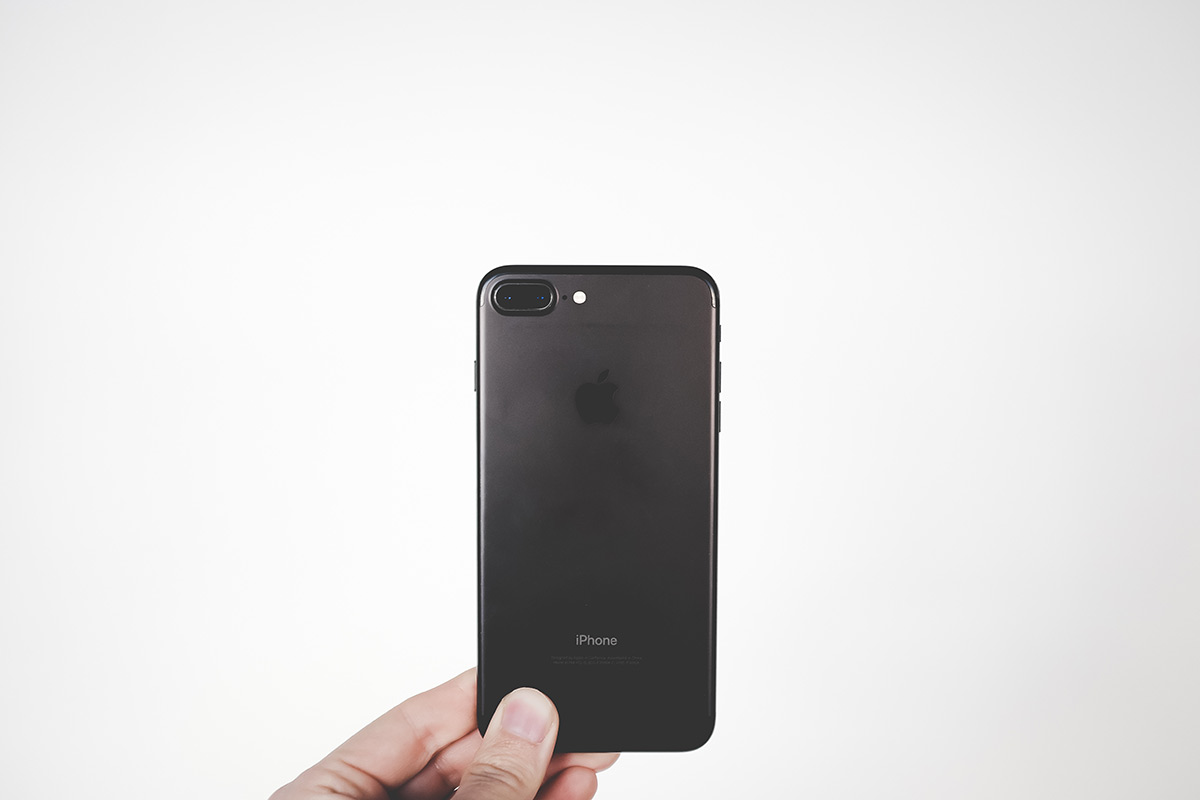
For designers, the only noticeable design changes are bolder titles and bigger use of cards, as seen in native apps like Music and News. Whereas iOS 7 started with a widespread use of thin fonts, iOS 10 is going back to using bolder texts.Sua is an interesting hybrid of a typeface. A handsome sans serif that comes in seven weights, Sua’s extended curves give it the same sort of authority that comes with a serif font, while the wide proportions make it easy and relaxing to read. The heavier weights are great for headlines, while the lighter weights make for complimentary subheadings and body text.
China is trying to weaken its currency without freaking markets
The nearer moon, hurtling suddenly above the horizon and lighting up the Barsoomian scene, showed me that my preserver was Woola.
